The Quiet Palette: Neutral Color Combinations That Ground a Minimalist Home
A minimalist home doesn’t have to be white to feel calm.
In fact, some of the most inviting minimalist interiors are built from a neutral color palette that barely announces itself.
Warm ivory. Soft beige. Mushroom. Taupe. Sand. Stone. Muted brown.
At first glance, these neutral paint colors may seem almost interchangeable. But spend a little time in a room built around them and you’ll notice the difference.
The space feels warmer. The light feels softer. The furniture feels more connected. And somehow, the room has depth without feeling busy.
That is the quiet power of a considered neutral color scheme.
The right neutral color combinations for a minimalist home don’t simply make a room look sophisticated — they create a visual foundation that lets natural materials, architectural details, lighting, and texture breathe.
And after exploring warm minimalism, layered lighting, and tactile materials, color becomes the next layer in the conversation.
The question isn’t simply, “What neutral color should I paint my walls?”
It’s: “How should these quiet colors relate to one another?”
Table of Contents
Why Neutral Colors Work So Well in Minimalist Interiors
Minimalist design depends heavily on visual restraint: clean lines, simple furniture, open space, limited decoration.
When there are fewer objects and fewer competing colors, every remaining element becomes more noticeable — including color.
– A bright white wall can feel stark when surrounded by similarly cool materials.
– A warmer ivory can make the same architecture feel softer.
– A cool gray can create a crisp, contemporary atmosphere.
– A warm greige can make a room feel grounded.
– A deep brown can give a pale neutral interior somewhere for the eye to rest.
This is why choosing a minimalist color palette isn’t as simple as choosing “neutral colors.” Neutrals have personalities. Some lean yellow, some lean pink, some lean gray, some carry subtle green undertones. Some feel warm; others feel cool. Two beige shades can look completely different beside the same sofa or flooring.
The secret isn’t finding one perfect neutral. It’s building a relationship between several quiet tones.
The Difference Between a Neutral Palette and a Flat Palette
There’s a common misconception that minimalist interiors should use almost exactly the same shade everywhere.
But a room filled with one uninterrupted neutral can quickly feel flat. The answer isn’t necessarily more color — it’s tonal variation.
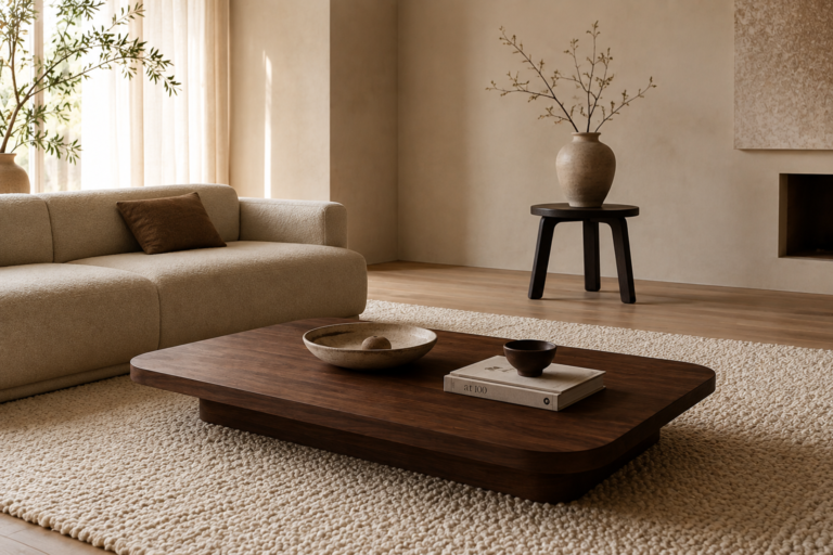
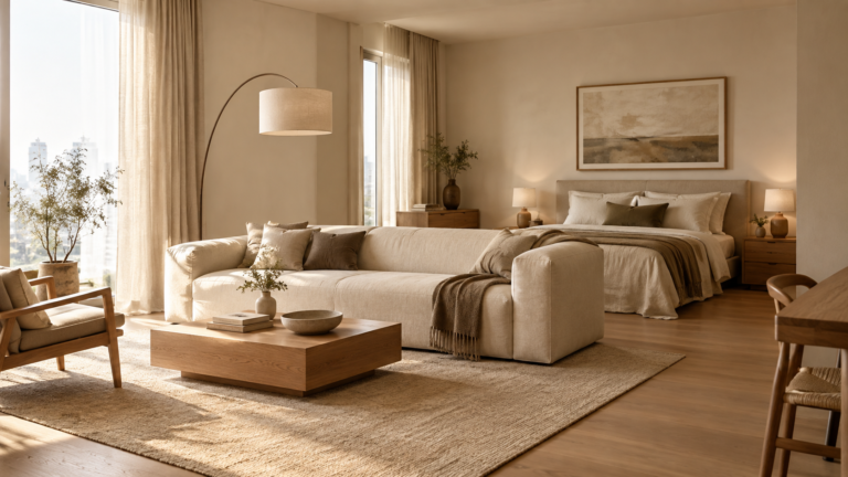
Imagine a room with warm ivory walls, a slightly deeper beige sofa, mushroom-toned cushions, natural oak furniture, a taupe rug, and one muted brown accent. The colors are all quiet, but they aren’t identical. That small amount of variation gives the eye somewhere to travel, which is one of the easiest ways to create depth in a minimalist interior without adding clutter.
Think of a neutral color palette as a conversation between related colors rather than one color repeated from wall to wall.
The Foundation: Warm Ivory
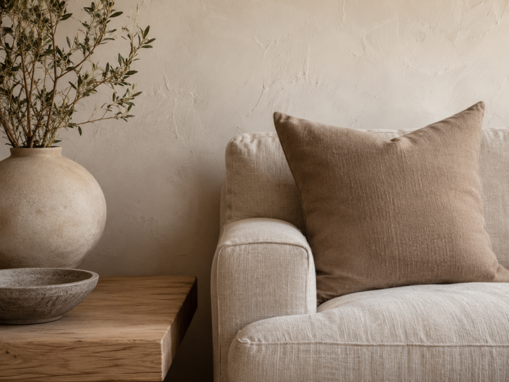
If you’re looking for a versatile starting point for a warm minimalist home, warm ivory is one of the most useful neutral paint colors.
Unlike bright white, warm ivory contains a subtle softness. It works particularly well with natural oak, linen, travertine, wool, ceramic, brushed brass, and warm stone.
It also responds beautifully to changing light. In the morning, it can feel light and airy. During the afternoon, it can become warmer. In the evening, it provides a soft backdrop for lamps and layered ambient lighting.
But don’t assume every ivory is warm — always check the undertone. An ivory with too much yellow can feel creamy or traditional, while an ivory with subtle beige or stone undertones feels far more contemporary. For a modern minimalist home, look for an ivory that feels soft rather than obviously yellow.
The Softness of Beige
Beige has returned to contemporary interiors for good reason. It’s warm without being overwhelming, and it works naturally with wood, stone, linen, wool, and other organic materials — making a minimalist room considerably more comfortable.
But beige isn’t one single color. It can move from pale oatmeal to sandy beige to deeper camel tones.
– A pale beige sofa against warm ivory walls creates a gentle tonal transition.
A deeper beige rug can ground the floor.
A sandy linen curtain can soften a large window.
The key is to avoid making every beige exactly the same. Let the tones shift — that subtle movement is where much of the sophistication comes from.
Mushroom and Taupe: The Bridge Neutrals
Mushroom and taupe are especially useful when you want a neutral color palette with a little more depth. Depending on their undertones, they can sit somewhere between beige, brown, and gray, which makes them excellent bridge colors.
– A mushroom-toned chair can connect warm ivory walls with darker wood furniture.
– A taupe rug can sit comfortably between a beige sofa and a stone floor.
– A taupe cushion can add depth without introducing an obvious color.
These shades are particularly effective when you want a sophisticated, slightly moodier interpretation of warm minimalism — creating contrast without becoming loud.
The Grounding Power of Earthy Brown
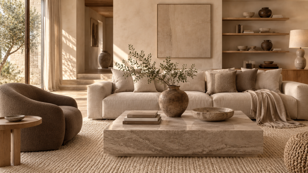
A neutral room doesn’t need to be entirely pale. In fact, one of the easiest ways to make a light neutral palette feel more sophisticated is to introduce a deeper earthy tone: walnut, cocoa, chestnut, espresso, dark oak, or muted clay brown.
These deeper shades act as visual anchors. A walnut coffee table can ground a pale living room. A dark wooden chair can give a neutral dining area more definition. A brown leather accent can add warmth without breaking the palette.
The trick is proportion — you don’t need dark brown everywhere. Think of a few carefully placed deeper elements as punctuation marks in an otherwise quiet sentence.
Stone as a Neutral
Stone deserves a place in almost any warm minimalist color palette, not only because of its material qualities, but because of its color.
– Travertine can introduce creamy beige.
– Limestone can bring soft gray-beige.
– Soapstone can add deeper charcoal tones.
– Marble can introduce subtle veining and tonal variation.
These aren’t colors that feel artificially selected — they come with natural variation, which makes them particularly valuable in minimalist interiors. A single piece of natural stone can contain several quiet shades within the same surface. Instead of choosing between beige and ivory, a piece of travertine may quietly contain both.
This is one reason natural stone works so beautifully with warm minimalist design: it introduces color without looking as though you’ve deliberately added color.
How to Combine Neutrals Without Making Them Look Random
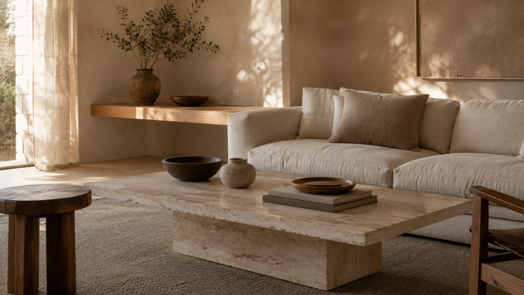
The easiest way to create a sophisticated neutral color palette is to give every shade a role. Think of your palette in three levels: light, middle, and dark
– Your lightest shades might include warm ivory, cream, and pale beige.
– Your middle tones could include sand, mushroom, taupe, and warm gray.
– Your darkest tones might include walnut, cocoa, espresso, or deep brown.
You don’t need equal amounts of each — in fact, you shouldn’t use them equally. A minimalist room usually feels calmer when the lightest tones occupy the largest visual areas, middle tones create depth, and darker tones create grounding points. This builds a natural visual hierarchy, so instead of seeing a collection of unrelated beige objects, the eye experiences a complete composition.
The 70–20–10 Neutral Palette Rule
If you’re unsure where to begin, try a simple 70–20–10 approach:
-70% light foundation — warm ivory, cream, and pale beige.
– 20% supporting mid-tones — taupe, mushroom, and natural wood.
10% deeper accents — walnut, earthy brown, or darker stone.
The percentages don’t need to be exact. They’re simply a framework for preventing the room from becoming either too flat or too visually heavy. And remember, natural materials already contain color — your oak floor, stone coffee table, linen sofa, and wool rug may each contribute several subtle tones. That’s not a problem. That’s the richness.
Warm Neutrals vs. Cool Neutrals
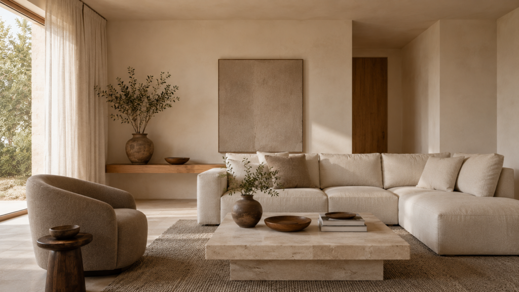
Not every minimalist home needs a warm palette. Cool neutrals — soft gray, blue-gray, cool white, cooler greige — can be beautiful too, creating a crisp, architectural feeling.
But if your goal is warm minimalism, natural materials, and tactile comfort, warmer neutrals will usually create a more cohesive result. Consider the materials already present in your room. If you have oak flooring, linen upholstery, travertine, wool, natural rattan, and warm brass, a cool blue-gray wall may create more contrast than you intended. It isn’t necessarily wrong — but it changes the mood.
Color should work with your materials, not compete with them.
How Lighting Changes Your Neutral Color Palette
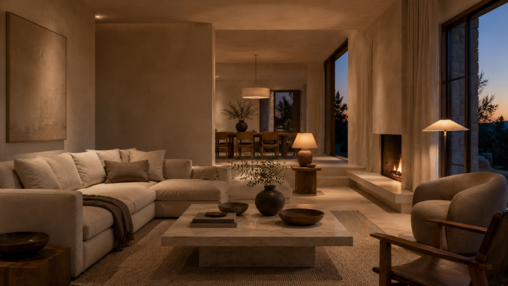
Color and lighting are inseparable. A neutral shade can look completely different depending on the light surrounding it.
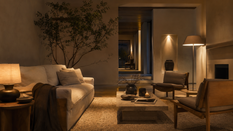
Natural daylight reveals undertones. Warm evening lamps make beige, ivory, and brown feel richer. Cool artificial lighting can make warm neutrals appear dull or unexpectedly gray.
This is why choosing paint from a tiny sample under one light source can be misleading. Look at your color in the morning, in the afternoon, and after sunset. Turn on your lamps, then look again.
The goal isn’t to find a neutral that looks exactly the same throughout the day. It’s to find one that changes beautifully with the light — one of the quiet pleasures of a considered home.
How Texture Changes the Way Neutrals Look
This is where the principles from our previous exploration of organic textures come back into the conversation.
Color never exists completely on its own — texture changes how we perceive it. A smooth beige wall feels different from a textured beige plaster wall. A linen sofa looks different from a velvet sofa in the exact same color. A matte ceramic object feels different from glossy ceramic. A wool rug absorbs light differently from a flat woven rug.
This is why a minimalist room can use several variations of beige without feeling repetitive — the surfaces are doing some of the visual work. So if your neutral palette feels flat, don’t immediately introduce another color. Try introducing another texture first. It may be all the room needs.
“Neutral tones can sometimes risk feeling flat unless you pair them by bringing organic textures and tactile comfort into your rooms.“
The Best Neutral Color Combinations for a Minimalist Home
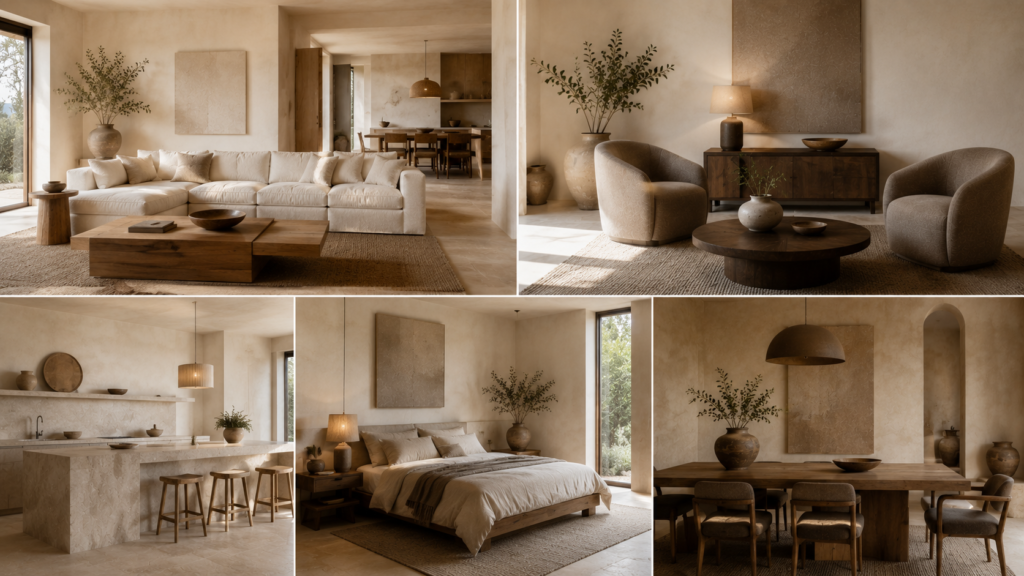
There isn’t one perfect neutral palette — the best combination depends on the atmosphere you want to create. Here are several minimalist color scheme ideas worth considering.
Warm Ivory + Natural Oak + Soft Beige
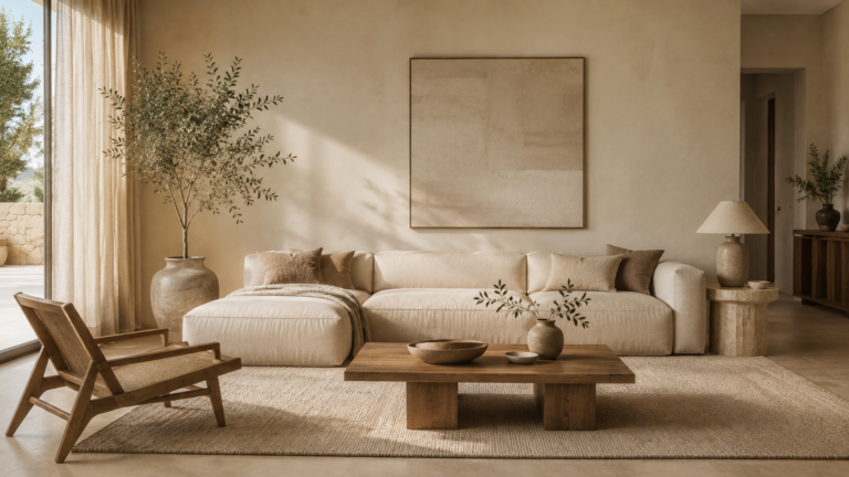
This is one of the easiest combinations for a warm minimalist living room. Warm ivory creates the foundation, natural oak adds warmth and organic character, and soft beige introduces comfort. The result is bright, relaxed, and timeless.
Ivory + Taupe + Walnut
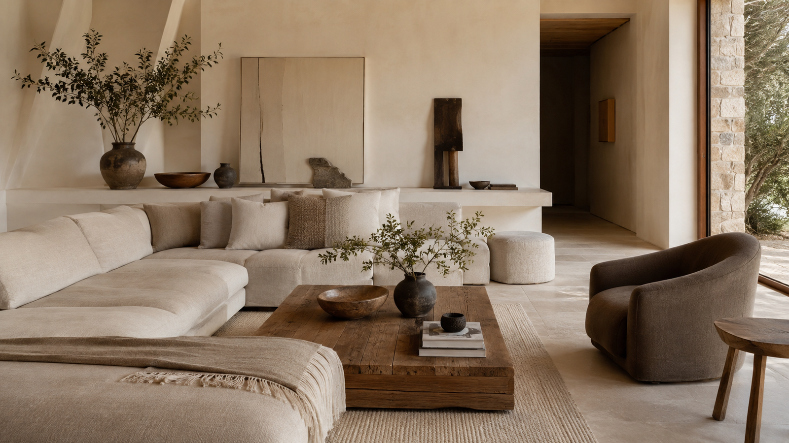
If you want something slightly more sophisticated and grounded, bring taupe and walnut into the mix. Ivory keeps the room light, taupe adds depth, and walnut provides contrast. This combination works particularly well in living rooms, dining spaces, and home offices.
Cream + Mushroom + Stone
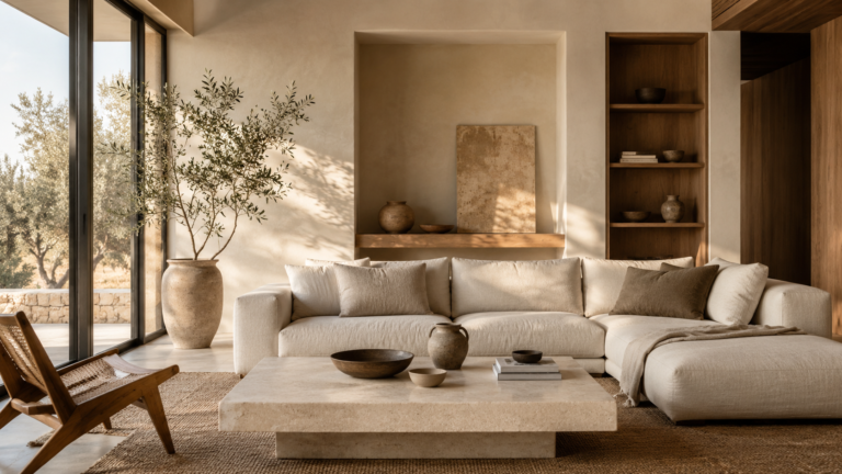
For a softer, more architectural palette, combine creamy neutrals with mushroom and natural stone. This creates a subtle tonal range that feels calm without becoming bland, and works beautifully with travertine, limestone, plaster, and linen.
Beige + Warm Gray + Natural Wood
If you prefer a slightly more contemporary palette, warm gray can bridge beige and wood. The important word is warm — a cool gray can shift the room toward a more clinical aesthetic, while a warm gray with beige or taupe undertones feels considerably softer.
Sand + Clay + Dark Brown
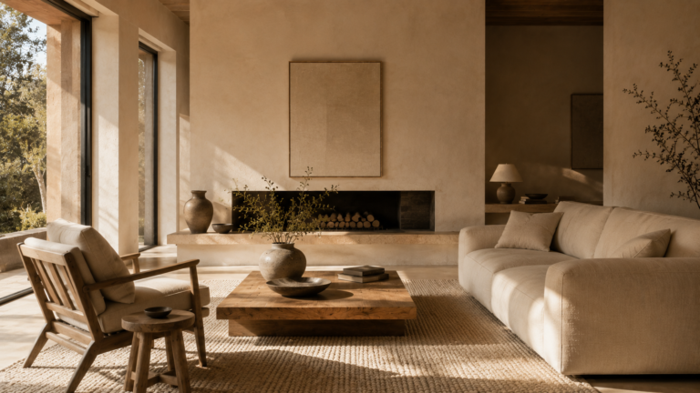
For a deeper, more earthy interpretation of minimalist design, consider sand with muted clay tones and dark brown. This palette works particularly well with natural stone, terracotta, aged leather, and darker timber — grounded without becoming heavy.
How to Choose the Right Neutral for Your Walls
Walls usually occupy more visual space than almost anything else in a room, which makes wall color one of your most important decisions.
“Choosing the right palette is the first crucial step when mastering the anatomy of quiet spaces to design a room that doesn’t feel empty.”
Before choosing a neutral paint color, look at the permanent materials in the room — your flooring, stone, wood, upholstery, and natural light. Then ask: does this neutral complement them?
“Before committing to a paint swatch, consider how layered ambient lighting and soft fixtures shift your room’s undertones throughout the evening.”
– If your floor has warm golden oak, an overly cool gray may create unnecessary tension.
– If your stone has cool gray veining, an extremely yellow beige may feel disconnected.
– If the room receives very little natural light, a soft warm neutral may help create a more welcoming atmosphere.
Color should respond to the room that already exists — not the room you imagine in a paint catalog.
The One-Undertone Rule
Here’s another useful trick: when working with several neutral colors, try to make sure they share a similar underlying temperature.
They don’t need to be identical — they simply need to belong to the same visual family. Warm ivory, warm beige, mushroom, taupe, natural oak, and walnut can work together because they share warmth. But if you suddenly introduce a blue-based gray or stark cool white, the difference becomes much more obvious.
Sometimes that contrast is exactly what you want. But if you’re trying to create a seamless, calming minimalist interior, consistency in undertone is often more important than finding the “perfect” individual color.
Don’t Forget the Ceiling and Trim
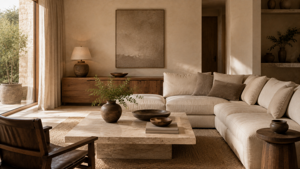
A neutral color palette isn’t limited to walls. Ceilings, doors, trim, cabinetry, and built-in shelving all contribute to the overall color story.
In some minimalist interiors, using a slightly warmer version of the wall color on the ceiling can create a softer, more enveloping feeling. You can also use tonal variations instead of sharp white contrasts — warm ivory walls with slightly deeper cream trim can feel more sophisticated than bright white trim, and natural oak cabinetry can become part of the palette rather than something treated separately.
The more unified these elements feel, the calmer the architecture becomes.
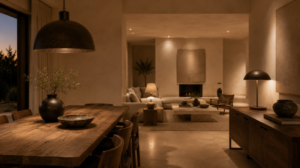
Use Dark Neutrals as Anchors
A room made entirely from pale neutrals can sometimes feel beautiful but slightly weightless. This is where dark neutrals help: a walnut table, a deep brown chair, a dark bronze lamp, a charcoal stone detail, a blackened metal frame.
These elements create visual anchors. Again, restraint matters — the purpose isn’t to create a high-contrast black-and-white interior, but to give the eye somewhere to land. Think of dark neutrals as punctuation. A few carefully placed marks can make an otherwise quiet palette feel much more intentional.
Common Neutral Palette Mistakes to Avoid
Even a simple color palette can go wrong:
1. Choosing too many nearly identical neutrals without enough tonal difference.
2. Mixing warm and cool undertones without realizing it.
3. Relying entirely on paint while ignoring the colors already present in natural materials.
4. Making every surface the same shade.
5. Assuming that minimalist means pale.
It doesn’t. Minimalism is about editing. A darker neutral palette can be just as minimalist as a pale one — a room built around warm brown, stone, mushroom, and deep taupe can feel incredibly calm when the proportions are right. The goal isn’t to make the room lighter. It’s to make the room feel intentional.
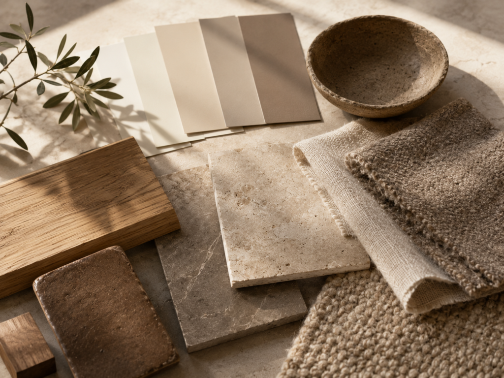
he 10-Minute Neutral Palette Test
Before committing to a new color, try this simple exercise:
1. Choose three to five colors and place them together.
2. Add samples of the materials already in your room — flooring, wood, stone, sofa fabric, metal finishes.
3. Look at everything together. Don’t judge each color individually — judge the relationship between them.
4. Move the samples around the room. Look at them in daylight, then in the evening, then beside your existing furniture.
This simple exercise can reveal undertones that aren’t obvious when you’re looking at a paint chip by itself.
A Neutral Home Doesn’t Have to Feel Bland
Perhaps the biggest misconception about neutral interiors is that they are boring. They can be. But they don’t have to be.
The difference comes from variation — in tone, texture, material, light, and scale. A warm ivory wall beside a mushroom sofa feels different from two identical beige surfaces. Natural oak beside travertine feels different from a room filled entirely with painted furniture. Linen beside wool creates a different experience from linen beside another smooth fabric. A deeper walnut accent gives a pale palette somewhere to rest.
This is how a neutral minimalist home develops character without relying on visual noise.
Let the Palette Follow the Architecture
Color should support the architecture rather than fight against it.
– If your home has beautiful natural light, don’t choose a color that becomes harsh under direct sun.
– If you have dramatic architectural lines, a restrained palette can allow them to become the focus.
– If the room has low ceilings, lighter tonal combinations may help it feel more open.
– If the space is large and open, deeper neutrals can help create a sense of intimacy.
The best neutral color combinations for a minimalist home aren’t chosen in isolation. They’re chosen in conversation with the space.
The Quiet Palette Checklist
Before finalizing your minimalist color palette, ask yourself:
– Do the neutrals share a compatible undertone?
– Is there enough tonal variation?
– Do the colors work with the existing wood?
– Do they complement the stone or flooring?
– Is there a clear lightest tone?
– Is there a middle tone that creates depth?
– Is there a darker neutral that grounds the room?
– Does the palette change beautifully in natural and artificial light?
– Are texture and material variation doing some of the visual work?
– Does the palette make the room feel calmer rather than simply more decorated?
The Quiet Palette: A Final Edit
Stand in the doorway of your room. Look at the colors as a whole. Don’t ask which color you like most — ask whether they belong together.
Does the ivory soften the architecture? Does the beige make the room feel comfortable? Does the taupe create depth? Does the wood bring warmth? Does the stone ground the palette? Does the darker accent give the eye somewhere to rest?
If the answer is yes, you probably don’t need another color. You may simply need to let the existing ones breathe.
Because the most successful minimalist interiors rarely depend on a single perfect shade. They depend on relationships: warm against cool, light against dark, soft against hard, matte against reflective, and quiet color against quiet color.
The Havelume Takeaway
A neutral color palette isn’t an absence of color. It is a study in subtlety.
Warm ivory can soften. Beige can comfort. Taupe can ground. Mushroom can bridge. Natural wood can warm. Stone can stabilize. Deep brown can anchor.
Together, these colors can create a minimalist home that feels calm without feeling cold, sophisticated without feeling formal, and layered without becoming cluttered.
The secret is not to choose more colors. It’s to choose better relationships between fewer colors.
Let the walls whisper. Let the wood speak. Let the stone ground the room. Let the textiles soften it. And let the palette become quiet enough that the architecture, materials, and everyday life inside the room can finally take center stage.