The Architecture of Calm: Why Your Minimalist Home Feels Empty (And How to Fix It)
Introduction: The Trap of Sterile Minimalism
There is a particular silence that settles into a room when everything has been removed. The surfaces are clear, the walls are white, and the furniture is reduced to a sofa and a single side table. By every conventional measure the space is minimalist. Yet standing in it, you feel something closer to unease than peace.
This is the trap of sterile minimalism. Many of us were taught that minimalism means subtraction: fewer objects, fewer colors, fewer decisions. Applied without discernment, that logic produces a room that resembles a showroom or a waiting area, orderly but not livable. The calm we were promised never arrives, because calm is not produced by absence alone.
The confusion is understandable. Social media and real estate photography have trained us to equate minimalism with bare surfaces and pristine white. But those images are staged for a camera, not for a person who needs to read, rest, host a friend, and recover from a long day. A room photographed once and a room lived in daily are judged by completely different standards.
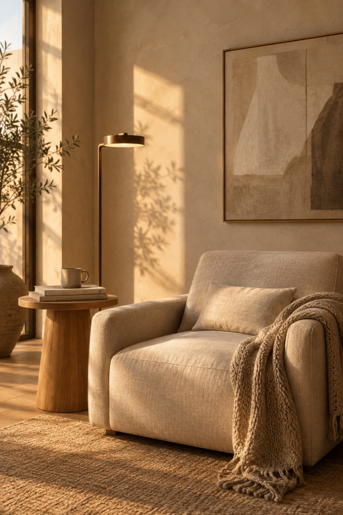
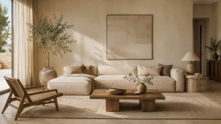
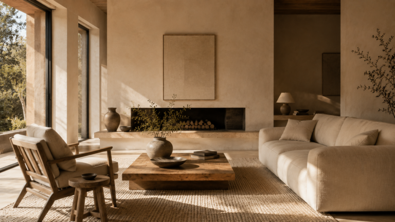
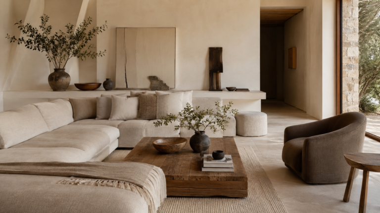
True minimalism is not about absence. It is about intentional presence. Every object, texture, and light source earns its place, and the things that remain are chosen to do more work. This is the foundation of warm minimalist interior design: a discipline that keeps the restraint of minimalism while restoring the sensory richness that makes a home feel inhabited.
If you want to see the full process of how to design a warm minimalist room from the ground up, start with our step by step guide.
In this guide, you will learn why bare rooms feel cold, what environmental psychology says about how we perceive space, and how four design pillars, applied room by room, turn an empty interior into a sanctuary.
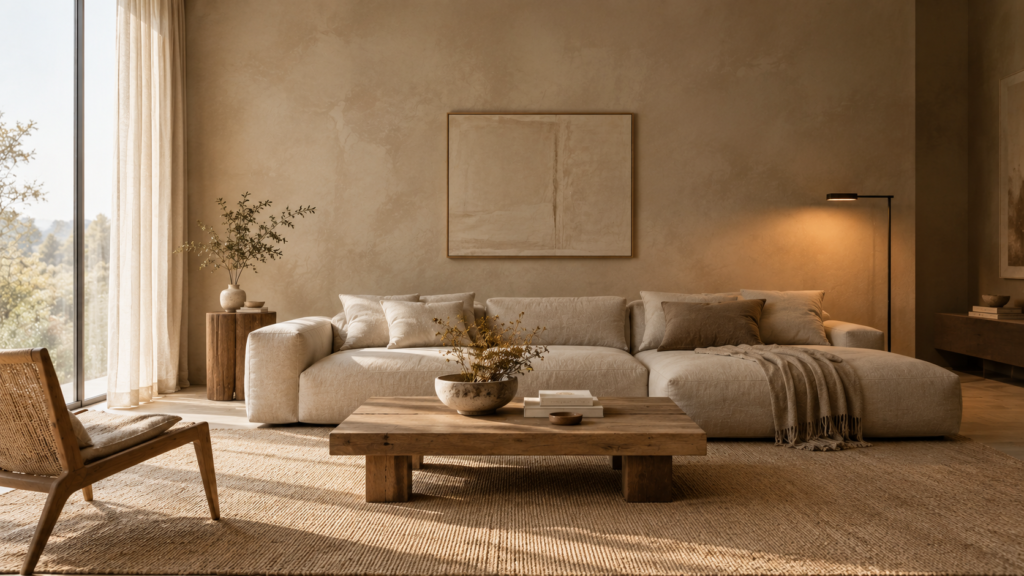
Table of Contents
The Psychology of Negative Space vs. Emptiness
Designers rely on negative space, the open area around and between objects, to give a room rhythm. A page of text needs margins, and music needs rests. In the same way, a room needs areas where nothing happens. But negative space and emptiness are not the same thing, and the human nervous system can tell the difference.
Curated and Spacious vs. Unfinished and Empty
Curated, spacious rooms feel resolved. The eye moves easily from one considered element to the next, and the open areas read as deliberate pauses. You sense that someone decided what belongs here and, just as importantly, what does not.
Empty rooms feel unfinished. There is nothing for the eye to rest on, no evidence of life, and no cue that the space was designed for a person. The openness is not a choice but a gap.
The difference comes down to relationship. In a curated room, open space exists in proportion to the objects around it. A generous stretch of wall beside a single large artwork feels luxurious. The same stretch of wall in a room with no art, no texture, and no lighting feels like a mistake.
How the Mind Responds to Space
Environmental psychology offers a useful framework here. People tend to respond positively to spaces that balance two qualities: prospect, meaning openness and clear sightlines, and refuge, meaning a sense of enclosure and shelter. We are most at ease when we can see our surroundings while feeling protected within them.
A stark, clinical room delivers prospect without refuge. Hard surfaces, harsh bright lighting, and uninterrupted sightlines leave you feeling exposed, even if you cannot say why. A warm minimalist room keeps the openness and adds anchors of softness, shadow, and material that make the space feel protective.
Acoustics and light matter as well. Bare hard surfaces reflect sound, creating a faint echo that the body registers as tension. Uniform bright light removes the shadows that help us read depth and form. Together, these produce the persistent unease people describe as a house that “doesn’t feel like home.”
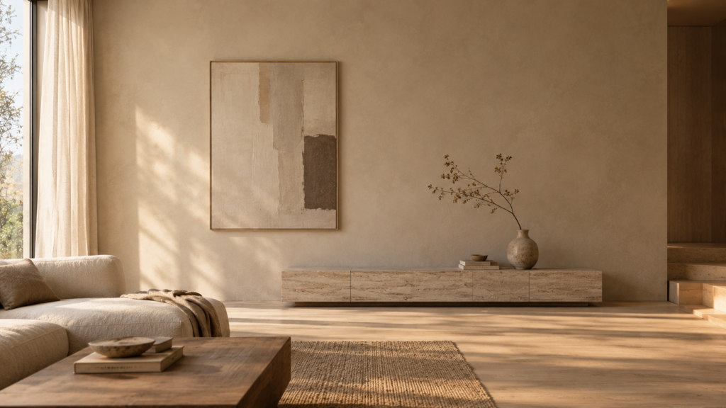
Signs That Your Space Reads as Empty
No focal hierarchy: nothing in the room is clearly the hero, so the eye wanders without landing.
Uniform surfaces: every material has the same flat, smooth finish, which reads as sterile.
Echo and glare: hard floors, bare walls, and uncovered windows bounce light and sound.
Absence of human traces: no books, no worn textures, no objects that suggest someone lives here.
Scale mismatch: furniture that is too small for the room leaves the space feeling abandoned rather than airy.
Practical takeaway: Negative space should feel intentional. If you cannot say why an area is left open, it is probably just empty. Give each open zone a neighbor that anchors it: an object, a texture, or a pool of light.
The 4 Pillars of Warm Minimalism
These minimalist interior design principles each address a specific cause of coldness. Together, they make a room feel layered and grounded without adding clutter.
Pillar 1: Tactile Layering
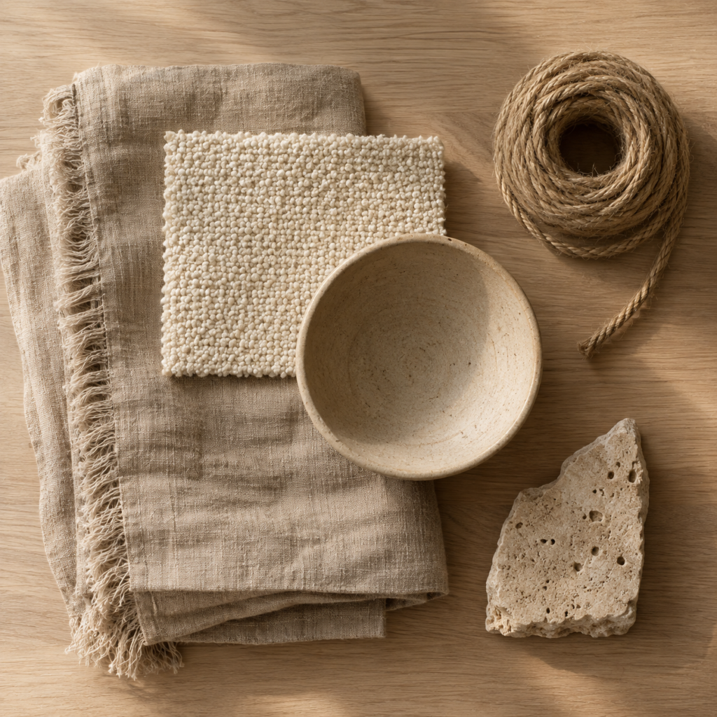
Texture is the most efficient source of warmth in a restrained room. When color and pattern are limited, the sense of touch, even implied touch, carries more of the sensory load. A quiet palette with varied surfaces feels rich. A quiet palette with uniform surfaces feels flat.
Think of texture as the minimalist’s substitute for pattern. Instead of adding visual noise through prints and color, you add depth through material: rough against smooth, matte against soft, heavy against light.
Raw or washed linen for curtains and bedding diffuses light and adds a soft, lived in drape.
Bouclé on a single statement chair or ottoman introduces a cloud like, nubby surface that invites touch.
Unglazed ceramics, such as matte stoneware vases and bowls, have a chalky finish that absorbs light rather than reflecting it.
Wool and jute underfoot add warmth, acoustic softness, and grounding.
Hand finished surfaces such as limewash, tadelakt, or brushed oak carry subtle variation that factory finishes lack.
The key is restraint within richness. Keep materials within a tight tonal family, such as cream, sand, oatmeal, and soft stone, so the layering feels cohesive rather than busy. The eye should register variety in surface, not variety in color.
Practical takeaway: Include at least three distinct textures in every room. If you are unsure where to begin, start with the largest soft surface, usually window treatments or a rug, and build outward.
For more ideas on bringing organic textures and tactile comfort into your rooms, read The Touch Test.
Pillar 2: Warm and Layered Lighting
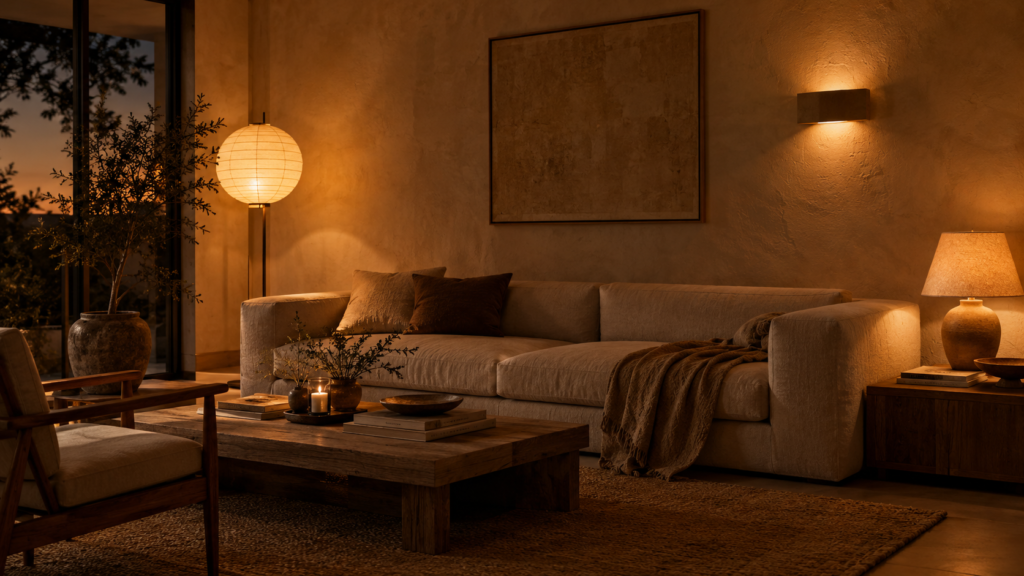
Lighting is the most overlooked reason minimalist rooms feel cold. A single overhead fixture flattens a room, erases shadow, and washes everything in uniform brightness. Shadow is not the enemy of a minimalist space. It gives form its depth and a room its mood.
Professional designers think of lighting in three layers: ambient (general illumination), task (focused light for reading or working), and accent (light that highlights texture or objects). A cold room usually has only the first, and badly.
Low level ambient sources: floor lamps and table lamps that pool light at or below eye level create intimacy.
Warm color temperature: choose bulbs between 2200K and 2700K. Above roughly 3000K, light begins to read as clinical.
Diffused shades: paper, linen, or opal glass soften the source and avoid points of glare.
Wall washing and sconces: light that grazes a plaster or limewashed wall emphasizes its texture and makes the surface glow.
Dimmers: the most useful single upgrade, letting a room shift from bright and functional by day to quiet and enveloping by night.
Consider the quality of light, not just its temperature. A high color rendering index (CRI of 90 or above) keeps natural materials like wood, linen, and stone looking true rather than gray.
Practical takeaway: Turn off the ceiling light this evening and try two or three low sources instead. The difference in mood is usually immediate.
Our guide to layered lighting for home goes deeper into bulb choices, lamp placement, and ditching overhead glare.
Pillar 3: The Rule of Asymmetry
Rigid symmetry and grid like arrangement are often mistaken for minimalism. In practice, perfectly mirrored layouts feel formal and static, like a hotel lobby. Warm minimalism borrows from Japanese and Scandinavian traditions, where balance comes from visual weight rather than mirrored duplication. The Japanese concept of ma, the meaningful interval between things, and the wabi sabi aesthetic, which finds beauty in imperfection, both inform this approach.
Asymmetry is not disorder. It is a more sophisticated kind of balance, in which a large, heavy element on one side is counterweighted by several smaller, lighter elements on the other.
Pair one heavy object on one side with two or three lighter objects on the other.
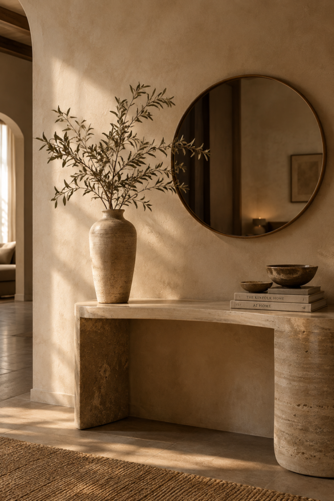
Introduce a sculptural, irregular element, such as a hand thrown vase, a branch, or an organically shaped coffee table, to interrupt straight lines.
Offset artwork or a mirror rather than centering everything above the furniture below it.
Group objects in odd numbers, varying their height and mass.
Leave deliberate gaps so arrangements feel discovered rather than staged.
The goal is controlled imperfection: a sense that the space has evolved over time rather than being installed in a single afternoon.
Asymmetry applies to furniture too, and it starts with learning how to mix wood tones instead of buying matching sets.
Practical takeaway: Find any surface you have styled symmetrically, such as a mantel or console, and shift one item off center. Then adjust the remaining pieces until the composition feels balanced rather than matched.
Pillar 4: Low Profile Proportions
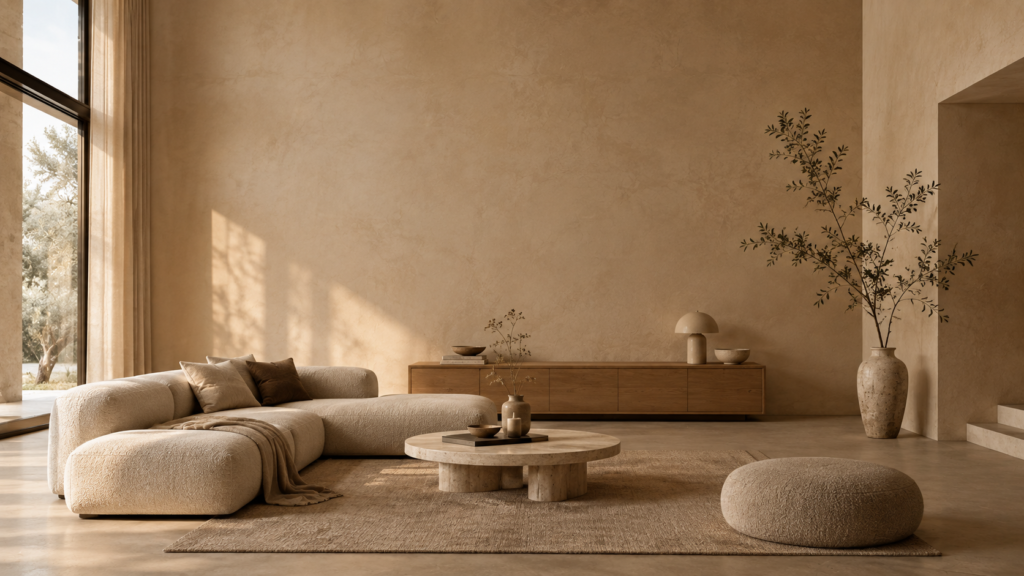
Furniture height strongly shapes how a room feels. When the visual weight of a space sits low, the ceiling appears higher, the walls recede, and the room takes on a calm, grounded quality. This is a core principle of modern organic interior styling, and it echoes the way people sit and live in many of the world’s most restful traditions: close to the ground, relaxed, and unhurried.
Low slung sofas and platform beds with minimal legs or a visible gap beneath let floor space flow and make furniture feel lighter.
Sideboards, shelving, and consoles kept at a modest height leave the upper walls open and uncluttered.
Art and mirrors hung slightly lower than convention suggests, closer to the furniture they relate to, read as a single composition.
Floor level seating, such as poufs, cushions, and low benches, reinforces an intimate scale.
Tall elements used sparingly, such as one floor lamp or a branch in a vase, provide a vertical accent that draws the eye upward.
Lower proportions create an inviting sense of enclosure while the vertical space feels more generous. In a room with a standard ceiling height, this contrast makes the space feel both cozier and more expansive at once.
To see exactly how low profile furniture changes the feel of a room, read our full breakdown.
Practical takeaway: Walk into your room and notice where your eye lands first. If it lands on tall, bulky furniture, replace one piece with a lower alternative and watch how the upper half of the room opens up.
Room by Room Breakdown: Adding Warmth Without Clutter
Knowing how to style a minimalist room means applying these pillars with restraint. The aim is never to add more, but to add better. Here is how the principles translate in two key spaces.
The Living Room
The living room is where most minimalist spaces lose their warmth, usually because a bulky entertainment unit anchors the whole room around a screen. When the television becomes the focal point, the room is organized around a black rectangle rather than around people.
If your space is edited but your minimalist living room still feels messy, this guide explains why.
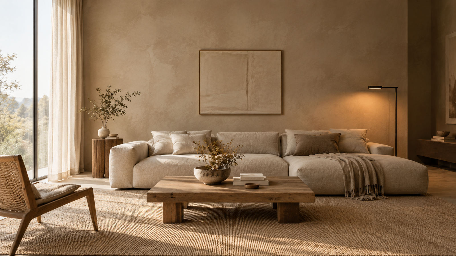
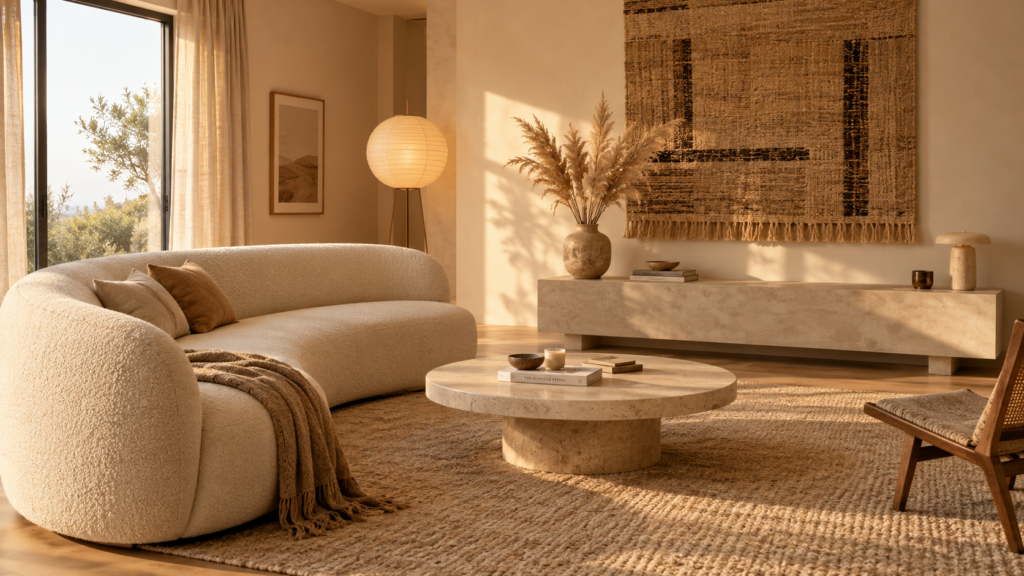
Swap the media wall for textural anchors. A plaster finish console, a slim wooden credenza, or a large woven wall piece gives the room a focal point that is not a television. If a screen is necessary, choose a low unit that keeps the wall above it open.
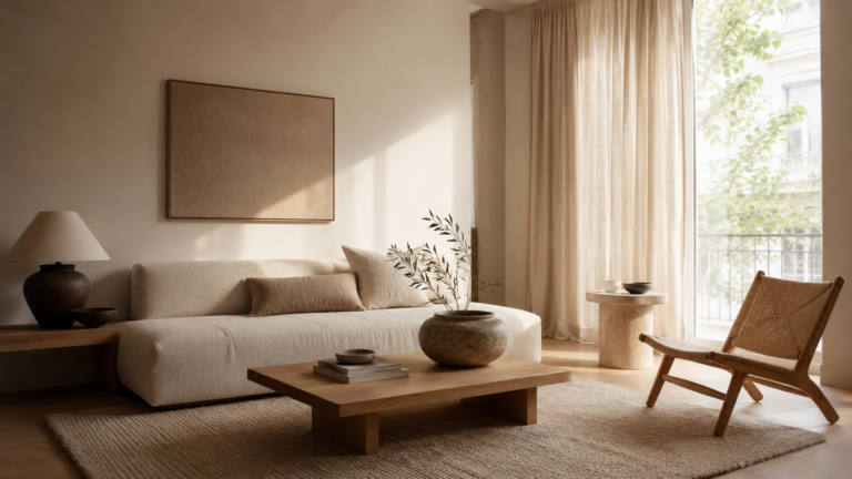
Choose low, deep seating in bouclé, washed linen, or soft wool, in oatmeal, sand, or warm stone tones. A modular or curved sofa softens the room’s geometry and encourages conversation.
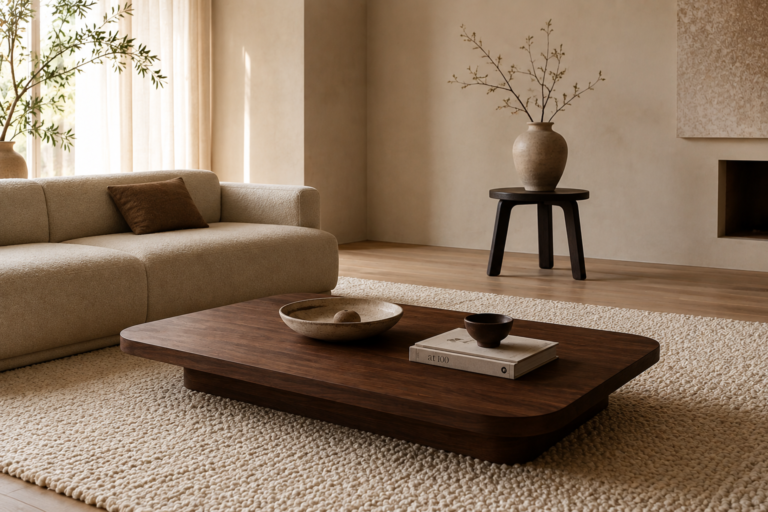
Use one oversized, organic coffee table rather than several small surfaces. A rounded travertine or solid wood piece brings in natural material and softens angles.
Layer the floor. A large wool or jute rug defines the seating area, absorbs sound, and adds warmth underfoot. Choose a size large enough that at least the front legs of all seating rest on it.
Add a single tall element, such as a floor lamp or a branch in a ceramic vessel, to draw the eye upward and balance the low furniture.
Curate, do not display. Choose three or four meaningful objects, such as a favorite book, a handmade bowl, or a framed photograph, rather than filling every shelf.
The Bedroom
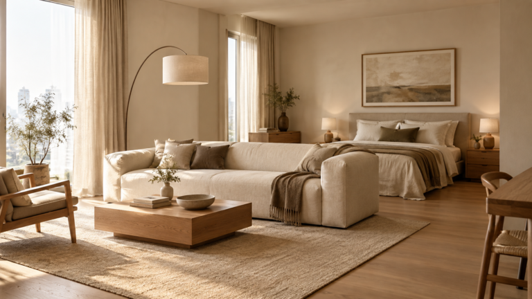
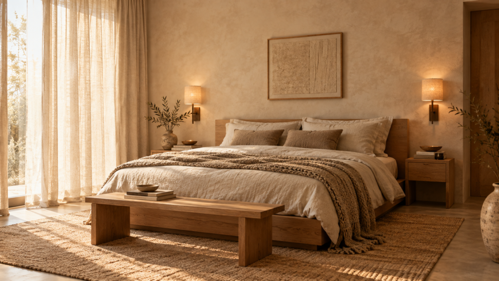
The bedroom should be the softest room in the home. Hard lines and cool tones work against rest, so the goal is to dissolve edges and create a cocoon like atmosphere through material and light.
Soften with organic bedding. Stonewashed linen in layered neutrals, with a chunky knit throw and mixed pillow textures, creates depth without pattern. The natural wrinkles of linen add a relaxed, unforced quality.
Consider plaster wall treatments. Limewash or Venetian plaster adds tonal variation that flat paint cannot, giving walls a gentle, shifting presence in changing light. For renters, textured paint or large fabric panels can create a similar effect.
Working with a small or rented space? See how to turn it into a warm minimalist sanctuary without major renovations.
Introduce subtle wood tones through a bed frame, nightstands, or a simple bench. Light oak and walnut add warmth without visual heaviness.
Light the room at bedside level. Wall sconces or small table lamps with warm bulbs replace the overhead fixture and make evenings feel calmer.
Keep surfaces minimal but personal: a lamp, a short stack of books, and one ceramic piece per nightstand is enough.
Dress the windows softly. Floor length linen curtains hung close to the ceiling add height, filter light, and soften hard edges.
Common Minimalist Design Mistakes That Trigger the “Cold” Look
A few recurring errors push even well intentioned rooms toward sterility. Recognizing them is half the work of correcting them, and it is the fastest route to making minimalist decor feel cozy.
Relying Solely on a Stark White or Flat Greige Palette
Cool, blue toned whites reflect blue light and can feel icy, particularly in north facing rooms that receive little direct sun. Flat greige often looks lifeless and muddy, especially under artificial light. Neither offers the depth that makes a room feel warm.
Choose warm whites with creamy or slightly yellow undertones, and layer them with soft beiges, clay, and muted earth tones. Introduce tonal variation within the palette, such as a slightly deeper wall behind the bed, rather than one flat color throughout. Always test paint samples at several times of day, since undertones shift dramatically with changing light.
For a complete walkthrough, see how to build a minimalist neutral colour palette that never feels sterile.
Forgetting Living and Natural Elements
A room without anything organic can feel rendered rather than lived in. Natural materials carry irregularity, such as grain, variation, and patina, that synthetic materials cannot replicate. They also age gracefully, which gives a minimalist room a sense of time.
Natural wood grain in furniture or accents, left visible rather than heavily lacquered.
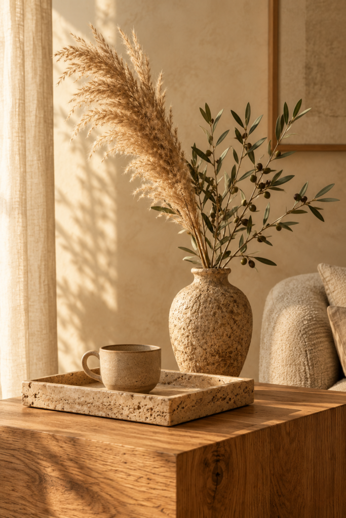
Dried foliage, such as pampas grass, olive branches, or eucalyptus, which adds height and softness without maintenance.
Unpolished stone, such as a travertine tray or a raw marble bowl, with natural variation and a matte finish.
Live plants, if your light allows, for a sense of growth and movement.
Other Pitfalls to Avoid
Overhead lighting alone, which flattens the room and erases depth.
Omitting textiles entirely, leaving hard surfaces to reflect sound and light.
Matching, mass produced objects that lack individual character. A few handmade or vintage pieces add soul.
Over editing, removing so much that the room no longer reflects the people who live in it.
Frequently Asked Questions About Warm Minimalism
What is warm minimalist interior design?
Warm minimalist interior design keeps the restraint and clarity of minimalism but adds natural textures, warm lighting, earthy tones, and organic shapes. The result is a calm, uncluttered home that still feels welcoming and personal.
How do I make a minimalist room feel cozy?
Start with lighting and texture. Replace overhead light with warm lamps at 2700K or below, then add layered textiles such as linen, wool, and bouclé. Natural wood, dried foliage, and handmade ceramics complete the effect without adding clutter.
What colors work best for a warm minimalist home?
Creamy whites, oatmeal, sand, soft beige, clay, and muted earth tones work best. Avoid blue toned whites and flat greige, and add tonal variation so the palette has depth.
Is warm minimalism the same as Scandinavian or Japandi style?
They are related. All three value simplicity, natural materials, and calm. Warm minimalism is broader and leans on softer textures, plaster finishes, and an earthy palette, while Japandi blends Japanese and Scandinavian influences more specifically.
Conclusion and Summary Checklist
A minimalist home feels empty not because it has too little, but because it lacks the quiet layers that make a space feel considered: texture, shadow, asymmetry, and natural material. At its best, minimalism is an editing tool, not an erasure of personality. You are not removing warmth. You are removing noise, so that what remains can be felt more clearly.
The most successful warm minimalist homes are not the ones with the fewest objects. They are the ones where every object, surface, and shadow has been chosen with care, and where the person living there can feel it.
Use this checklist to review your own space:
Texture: Do I have at least three distinct tactile materials in the room?
Lighting: Is the room lit by low, warm sources rather than a single overhead light, with bulbs around 2700K or warmer?
Asymmetry: Is there at least one organic or off center element that breaks rigid symmetry?
Proportion: Is my furniture low enough to keep the upper walls open and the ceiling feeling high?
Palette: Are my whites warm, with tonal variation rather than one flat color?
Living elements: Is there natural wood, stone, or foliage present?
Acoustics: Do soft materials like rugs, curtains, or upholstery offset hard surfaces?
Personal traces: Can I see evidence of the people who live here, such as books, handmade objects, or meaningful art?
Intention: Can I explain why each object and each open space is there?
Begin with one change, perhaps swapping a bulb or adding a single textured piece, and notice how the room responds. Calm is built gradually, one deliberate layer at a time.
For specific pairings, explore these neutral color combinations that ground a minimalist home.