Minimalist Neutral Colour Palette: How to Create a Warm, Layered Home That Never Feels Sterile
A neutral room should feel calm, not cold.
There is a fine line between a beautifully restrained interior and a space that feels unfinished. Too much stark white reads clinical. Too many cool grays drain the warmth out of a room. And when every surface lands on the same shade of beige, even a carefully planned home can start to feel flat.
The fix isn’t abandoning minimalism.
It’s understanding how warmth, undertone, texture, and contrast work together inside a minimalist neutral colour palette.
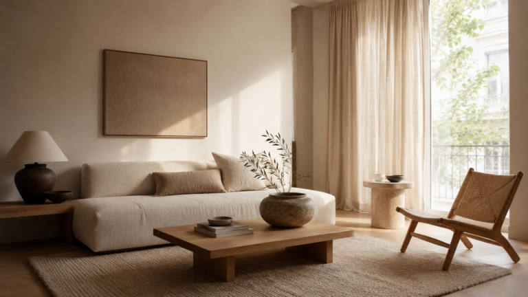
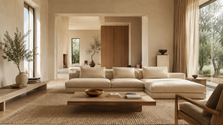
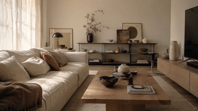
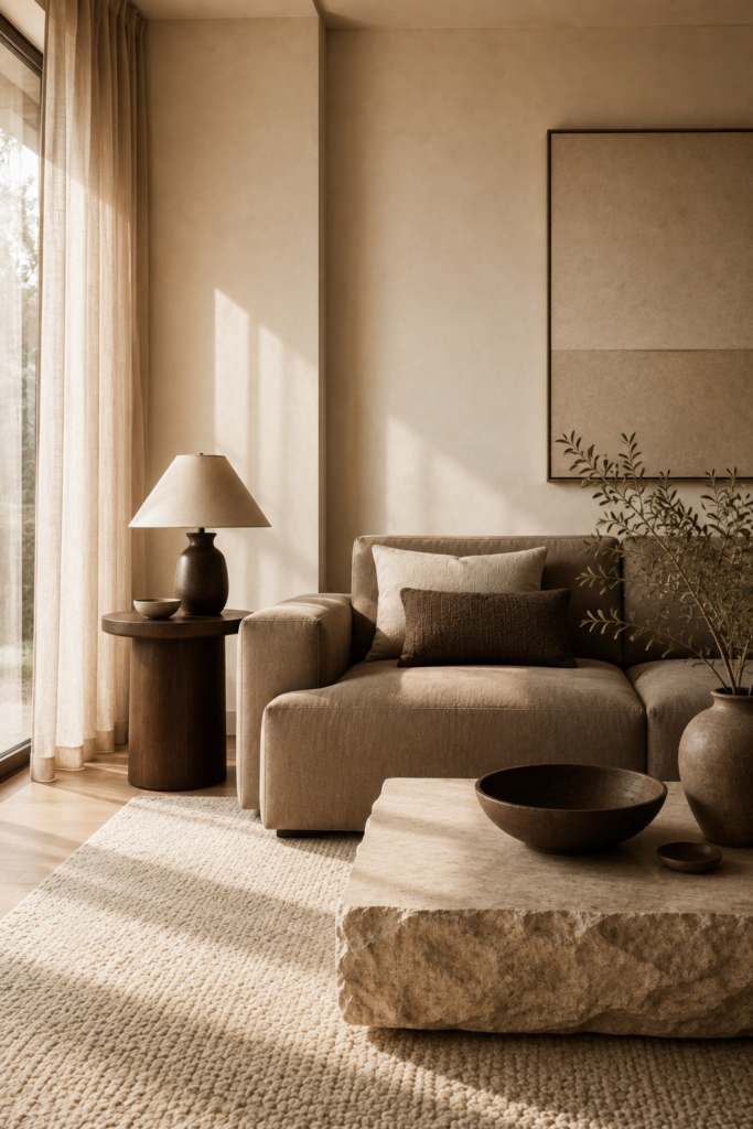
Think warm ivory walls, natural oak, soft linen, earthy stone, and muted taupe, with enough tonal variation to reveal itself slowly as you move through the space.
That’s the foundation of warm minimalism: less visual noise, more sensory depth.
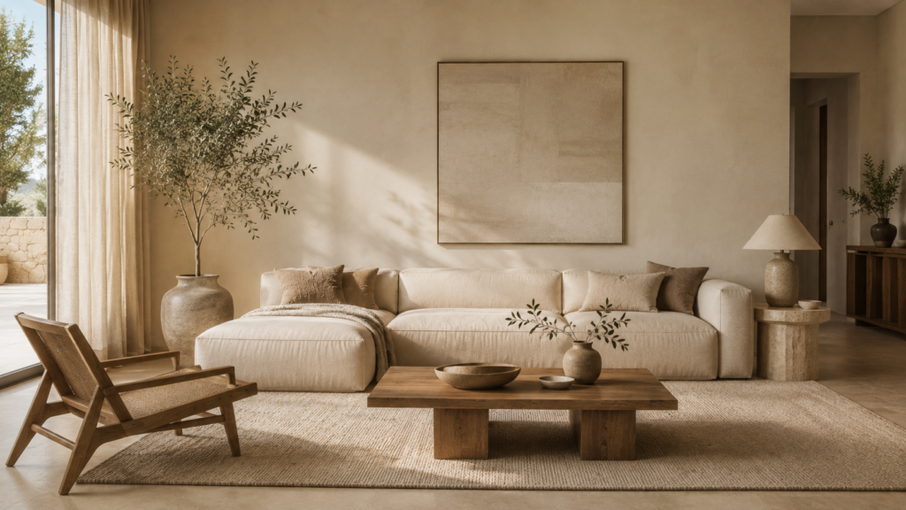
Table of Contents
What Is a True Warm Minimalist Neutral Palette?
A true warm minimalist neutral palette is more than a handful of beige paint chips.
It’s a balanced family of tones that share warm or earthy undertones, with enough variation between them to create depth. The palette might include:
Warm ivory instead of bright white
Cream instead of cool gray
Oatmeal instead of pale beige
Taupe instead of blue based gray
Sand and camel for subtle contrast
Natural oak and walnut for organic warmth
Travertine, limestone, or other soft stone tones for grounding
The key word is variation. A successful neutral interior rarely repeats one color everywhere. Instead, several closely related tones work together to create a monochromatic base with subtle shifts in temperature, value, and texture. That’s what keeps a minimalist neutral colour palette from tipping into sterile.
Warm neutrals also pair naturally with raw materials. Wood adds depth. Linen softens hard architectural lines. Stone adds weight. Wool softens what’s underfoot.
The result stays minimal, but never empty.
The Difference Between Warm and Cool Neutrals
Not every neutral runs warm.
White can carry blue, gray, yellow, or creamy undertones. Gray can lean blue, green, beige, or brown. Even beige can read cool depending on what surrounds it and the quality of the light hitting it.
Before committing to a wall color or a large piece of furniture, check its undertone.
Warm neutrals usually carry hints of yellow, red, brown, cream, warm gray, or earthy beige. Cool neutrals lean toward blue, blue gray, green gray, or cool white.
For a warm minimalist interior, the goal isn’t to use only warm tones. A small dose of contrast can actually make the palette feel more considered. The real trick is keeping the overall visual temperature consistent.
The 60 30 10 Rule for a Minimalist Neutral Colour Palette
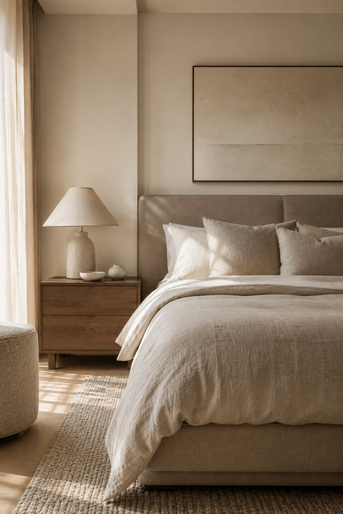
One of the easiest ways to balance a neutral interior is the 60 30 10 rule, a simple framework for how much of each tone to use.
60 Percent: Dominant Neutral
Your dominant color covers the largest surfaces in the room. This might be warm ivory walls, cream upholstery, soft beige cabinetry, or light taupe flooring. Treat it as the visual foundation.
30 Percent: Supporting Neutral
The second tone adds contrast without breaking the calm. Bring it in through furniture, curtains, rugs, cabinetry, or large decorative pieces. Warm ivory walls, for instance, pair well with oatmeal upholstery and taupe curtains.
10 Percent: Accent Tone
The final layer is where slightly deeper or more distinctive tones come in: walnut, muted brown, terracotta, charcoal brown, aged brass, or deep olive. Keep the accent restrained. In warm minimalism, ten percent is plenty to create visual punctuation without taking over the room.
Four Warm Neutral Colour Combinations to Copy
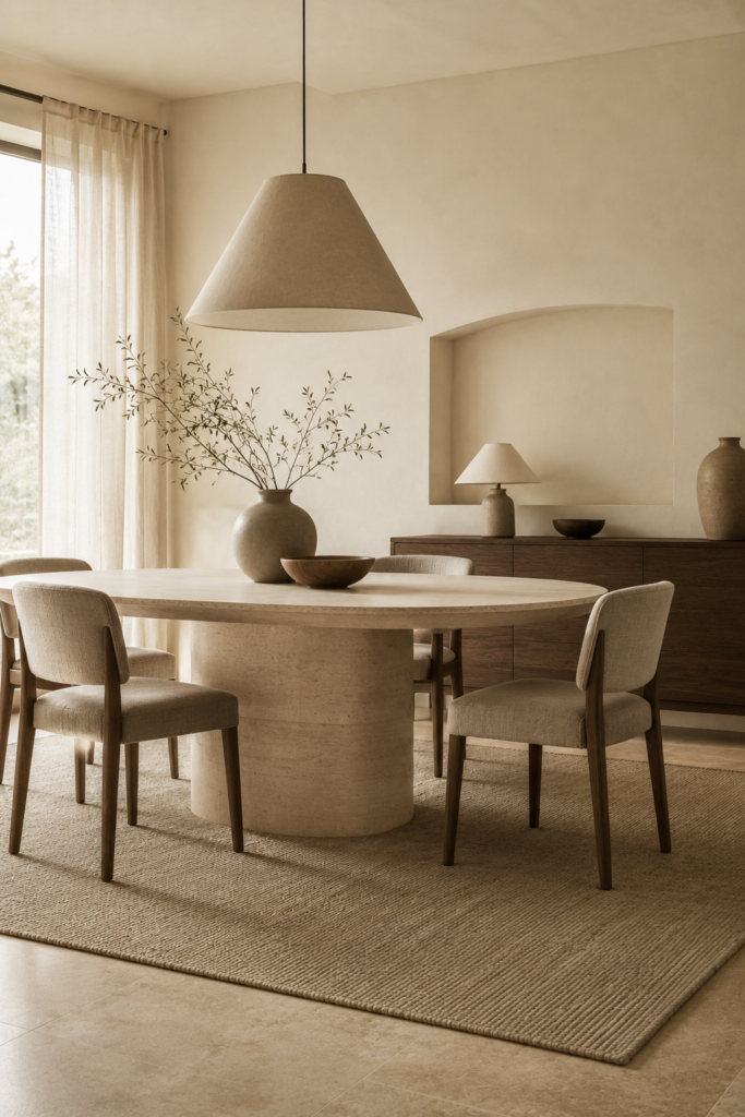
You don’t need to reinvent a minimalist neutral colour palette from scratch. These four combinations are reliable starting points for different rooms and moods.
1. Warm Ivory, Natural Oak, and Oatmeal
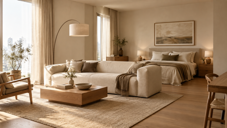
One of the easiest combinations for a bright, welcoming interior. Use warm ivory on the walls, bring in natural oak through furniture or flooring, then soften the space with oatmeal linen, wool, or upholstery. It reads light without going stark, and it works well in living rooms, bedrooms, and small apartments that need to stay airy.
“For compact layouts, our guide to styling small apartment rooms into a warm minimalist sanctuary breaks this down further.”
2. Soft Beige, Cream, and Walnut
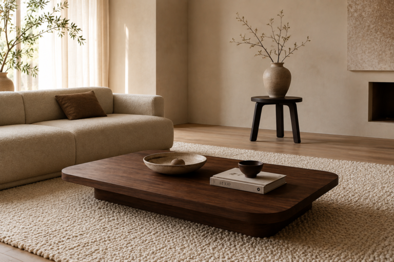
For something richer, combine soft beige with creamy whites and deeper walnut. The walnut adds contrast and gives the palette a more grounded, architectural feel. Keep walls and large textiles light, then let walnut furniture or smaller accents carry the depth. Pairs beautifully with brass lighting and handmade ceramics.
3. Taupe, Warm White, and Stone
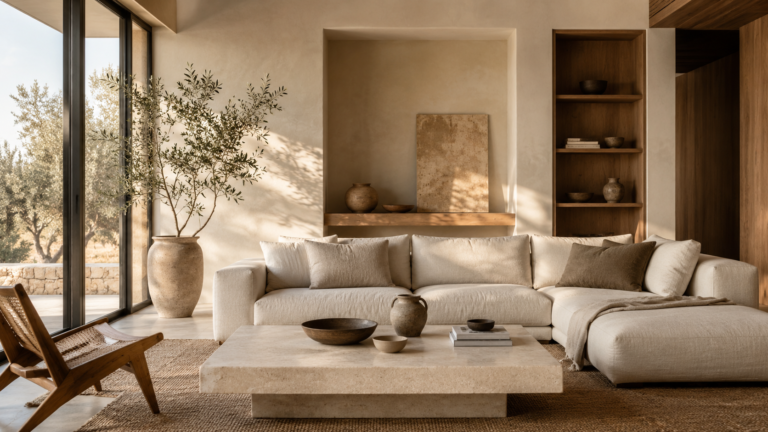
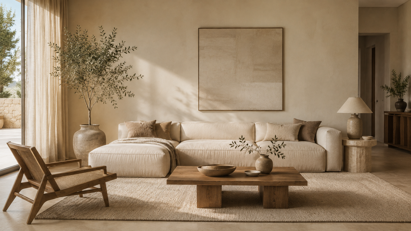
Taupe brings a sophisticated earthiness to minimalist rooms. Pair it with warm white walls or upholstery, then bring in natural stone through a coffee table, countertop, fireplace, or accessories. The stone’s natural variation keeps the palette from looking too matched. Especially effective for a contemporary quiet luxury look.
4. Sand, Linen, and Muted Brown
For a more relaxed atmosphere, build around sand tones and natural linen, then add muted brown through wood, leather, ceramics, or small accents. The result feels understated and tactile rather than overly polished, and works well in bedrooms and other spaces built around comfort.
How to Add Texture So Neutrals Never Feel Flat
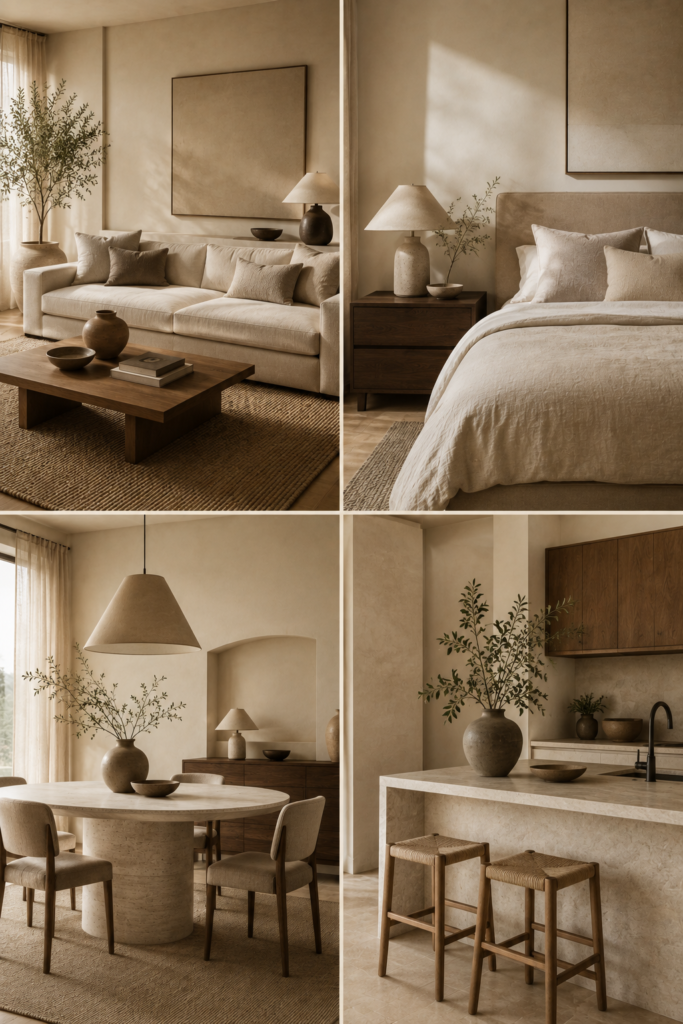
This is where a neutral interior gets interesting. Once strong color is off the table, texture becomes your main design tool.
“Our touch test guide to tactile design covers this in more depth.”
A room with five different beige objects can still look flat if every surface has the same finish. But give those same tones different materials, rough plaster, washed linen, bouclé, wool, natural oak, travertine, handmade ceramic, brushed metal, and the palette suddenly has depth. The colors stay quiet, but the eye has plenty to find.
Layer Materials, Not Just Colors
Instead of asking what other color the room needs, ask what other texture it needs.
If the walls are smooth, bring in woven textiles. If the furniture is upholstered, add a rough stone surface. If the flooring is hard, lay down a thick wool rug. If the palette runs very pale, ground it with darker natural wood. This keeps the color scheme restrained while making the room feel rich and dimensional.
Use Light to Change How Your Neutrals Feel
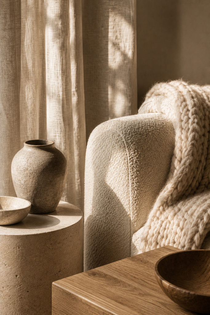
The same neutral color can look completely different across the day. Morning light softens warm ivory into something creamy. Afternoon sun pulls out the beige and gold undertones. At night, warm lamps deepen taupe and make it feel more intimate.
That’s why lighting deserves as much thought as your color palette. Before you settle on paint, fabric, or large furniture, watch the room at different times of day, then choose lighting that supports the mood you’re after. Instead of relying on one overhead fixture, layer floor lamps, table lamps, wall lights, pendants, candles, and soft accent lighting.
A warm neutral palette paired with layered lighting is what makes a minimalist room feel quietly luxurious instead of just bare.
Avoid the Everything Beige Trap
There’s a real difference between a neutral palette and a beige box. If every surface matches, the room loses its architectural definition.
The fix isn’t necessarily bright color. It’s contrast through tone and material. Pair pale walls with slightly darker furniture. Combine matte surfaces with a bit of sheen. Set rough stone beside soft linen. Use dark wood sparingly against lighter upholstery. Bring in one or two deeper accents so the eye has somewhere to land.
Minimalism gets more interesting when there’s something to notice.
How to Choose a Neutral Palette for Your Own Home
Start with the room’s permanent elements: flooring, countertops, cabinetry, architectural details, and natural light. From there, choose your dominant neutral, then a supporting neutral that creates gentle contrast, then one or two accent materials.
A simple formula: dominant neutral, supporting neutral, natural material, tactile texture, restrained accent.
For example: warm ivory, taupe, natural oak, linen, walnut.
Or: cream, sand, limestone, wool, muted brown.
The goal isn’t perfection. It’s coherence. When every element belongs to the same visual conversation, even a small or modest room can feel remarkably considered.
The Quiet Power of a Well Chosen Neutral Palette
A minimalist neutral colour palette works because it gives the eye somewhere to rest. It cuts visual noise without stripping out character, lets the architecture read more clearly, and makes natural materials feel richer. It also builds a foundation that can evolve over time without a full redesign.
The best neutral interiors aren’t empty. They’re edited. They use warm neutrals, earthy undertones, tactile materials, and quiet contrast to feel calm but still lived in.
Before reaching for another decorative object, look at the palette first. Could it use a warmer undertone? Could a natural material add more depth? Could a different texture make the same neutral feel new again?
Sometimes the most effective change isn’t more color. It’s choosing the right neutrals and letting them breathe.
A Neutral Palette That Feels Like Home
The most successful minimalist interiors aren’t defined by how little they contain. They’re defined by how well everything works together.
A warm ivory wall reads completely differently next to cool gray furniture than it does next to natural oak and linen. A beige room can feel ordinary when every surface shares the same finish, or genuinely sophisticated once stone, wool, wood, ceramic, and woven textiles bring in variation.
That’s the real strength of a minimalist neutral colour palette. It offers restraint without losing warmth, and simplicity without losing character, all while staying flexible enough to grow with your home.
If you’re building a warm minimalist home, start with the colors already in your space. Study the light. Notice the undertones. Bring in natural materials. Layer tactile textures. Then edit.
You may find the room doesn’t need another color at all. It just needs a better relationship between the colors you already have.
Explore more Havelume design guides for practical ways to create a warmer, calmer, and more intentional home.