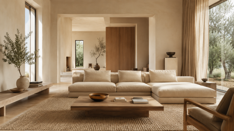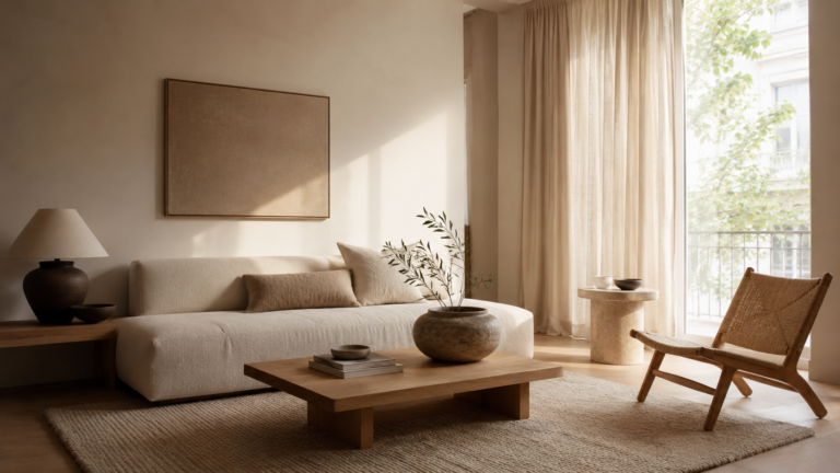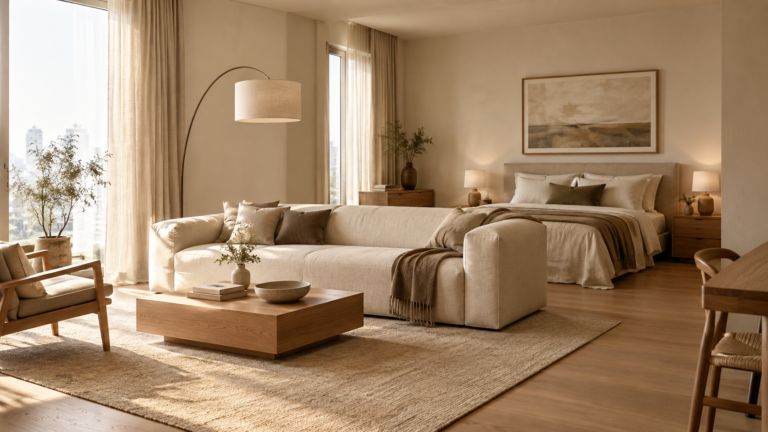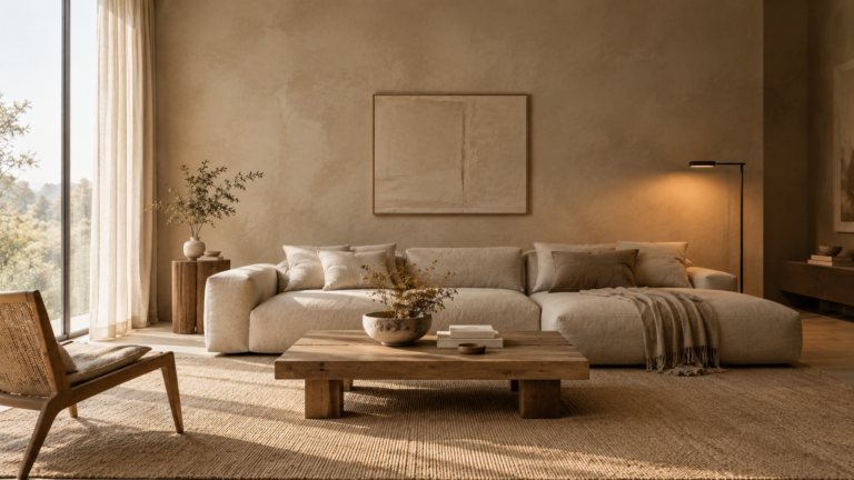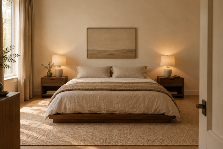
The Minimalist Neutral Colour Palette: 5 Architectural Formula Rules (and Exact Paint Codes)
A minimalist neutral colour palette works when every large neutral in the room shares one undertone and a single dark note holds the pale colours in place. Most palettes fail at the first part: a cream wall, a grey sofa and a beige rug each lean a different way, so the room feels unsettled instead of calm. The five rules below fix that, with paint codes you can take to a shop.
Answer box
A minimalist neutral colour palette uses three or four neutrals that share one undertone, set in steps from light to deep: pale trim and ceiling, a mid tone wall, a small dark accent. Match the undertone to your window direction and wood, then test large samples for two or three days before committing.
In this article
Table of Contents
Rule 1: Fix one undertone for the whole room
Pick one undertone, warm or cool, and make every large neutral in the room agree with it. Undertone is the faint hue hiding inside a neutral: yellow, pink, green, blue or violet. On a single wall you hardly see it. When two neutrals meet, one of them suddenly looks pink or green.
That is why a cream wall beside a cool grey sofa feels wrong even though both count as neutral. Neither is a bad choice. They just pull in different directions.
Myth versus reality: the myth says white, beige and grey are interchangeable because they are all neutral. In reality they share a label, not an undertone.
Formula: one undertone family, three or four neutrals, applied to the large surfaces: walls, sofa, rug and curtains.
To read an undertone, hold the paint chip against a sheet of plain white printer paper in daylight. The hue the chip leans toward beside the paper is its undertone. Farrow & Ball describes Skimming Stone (No. 241) as a pale milky grey with warm stone undertones, and places Elephant’s Breath (No. 229) one step deeper in the same family of contemporary neutrals. Staying with neighbours like these is the easiest way to keep the undertone steady.
Rule 2: Step the depth from ceiling to wall to joinery
Use steps of depth instead of extra colours. Ceiling and trim sit lightest, the walls sit one or two steps deeper, and a single deeper tone is saved for built in shelving, an alcove or one wall. Edges soften when neighbouring surfaces differ by a small step, and that softness is a large part of the quiet.
Formula: walls on one chip, trim and ceiling in a lighter white from the same family, one deeper tone two or three chips darker on the same strip.
Farrow & Ball’s own scheme suggestions for Skimming Stone include Strong White No. 2001 as the complementary white, plus Wimborne White No. 239 and Elephant’s Breath No. 229. In a warm room, Wimborne White tends to be the more natural ceiling colour because it leans warm, while Strong White reads cleaner beside grey toned furniture.
Rule 3: Read your windows before you read the paint chip
The same paint looks different in every room because light changes it. In the northern hemisphere, a north facing room tends to get cooler, steadier light that can flatten pale and cool neutrals, while a south facing room gets warmer, stronger light and forgives more. East rooms are brightest in the morning, west rooms in the evening, and in the southern hemisphere the north and south sides swap.
Formula: in a dim or north facing room, go one step warmer and one step lighter than your first instinct. In a bright south facing room, you can go a step deeper or cooler.
Fix the lighting before you judge any colour. Fit warm bulbs in the lamps you will actually use in the evening. A bulb rated around 2700K gives a soft yellow white, while 4000K reads noticeably cooler and tends to make warm greiges look greyer.
Illustrative example: take a living room of about 18 square metres (4 by 4.5 metres) with one north facing window and an oak floor. A workable version of the formula is Wimborne White No. 239 on the ceiling and trim, Skimming Stone No. 241 on the walls and Elephant’s Breath No. 229 on the shelving alcove. The walls are warm enough to push back against the cooler light, and the oak floor usually adds the yellow the walls leave out. This shows the method, not a measured result.
Rule 4: Count your wood as a colour
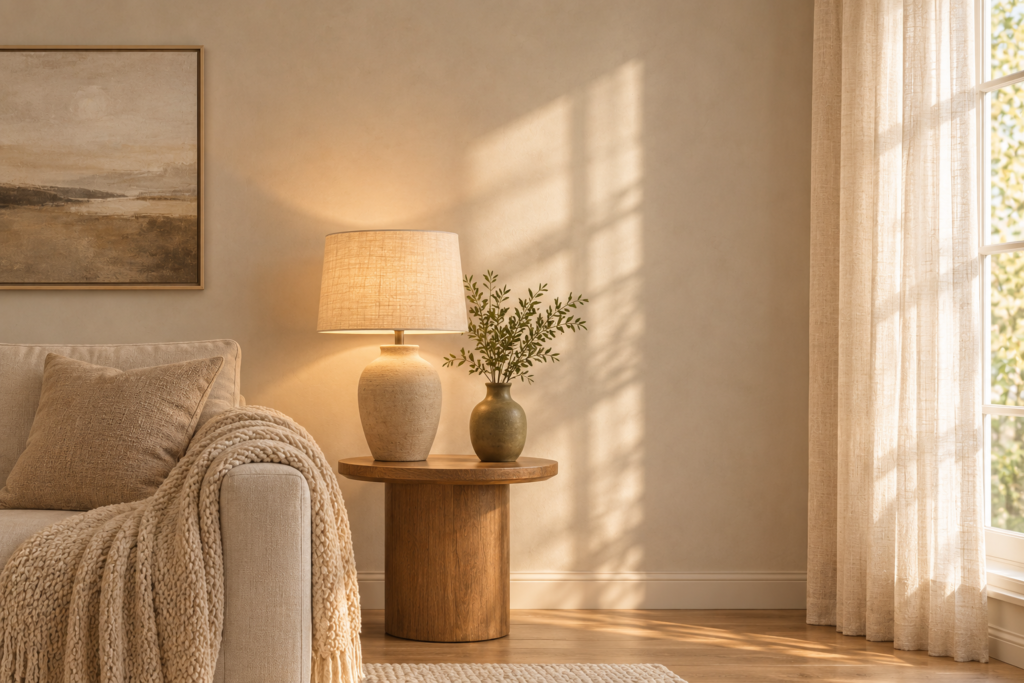
Treat the floor and large wooden furniture as one of your neutrals, and choose paint that agrees with their undertone. Oak and ash often carry yellow or golden tones, while walnut and dark stained woods lean brown, sometimes with a red or purple edge. Cool grey paint beside orange toned wood tends to make the wood look more orange, so a warm plaster or greige wall usually sits better.
Formula: match the undertone of the largest wood surface first, then vary only the depth.
Depth is where you choose. With dark wood, a lighter wall gives the room space to breathe. With pale wood, a slightly deeper wall stops the floor and walls from merging into one flat field. If you already have several wood finishes, you can mix wood tones as long as one undertone leads the room.
Rule 5: Add one dark note and keep it small
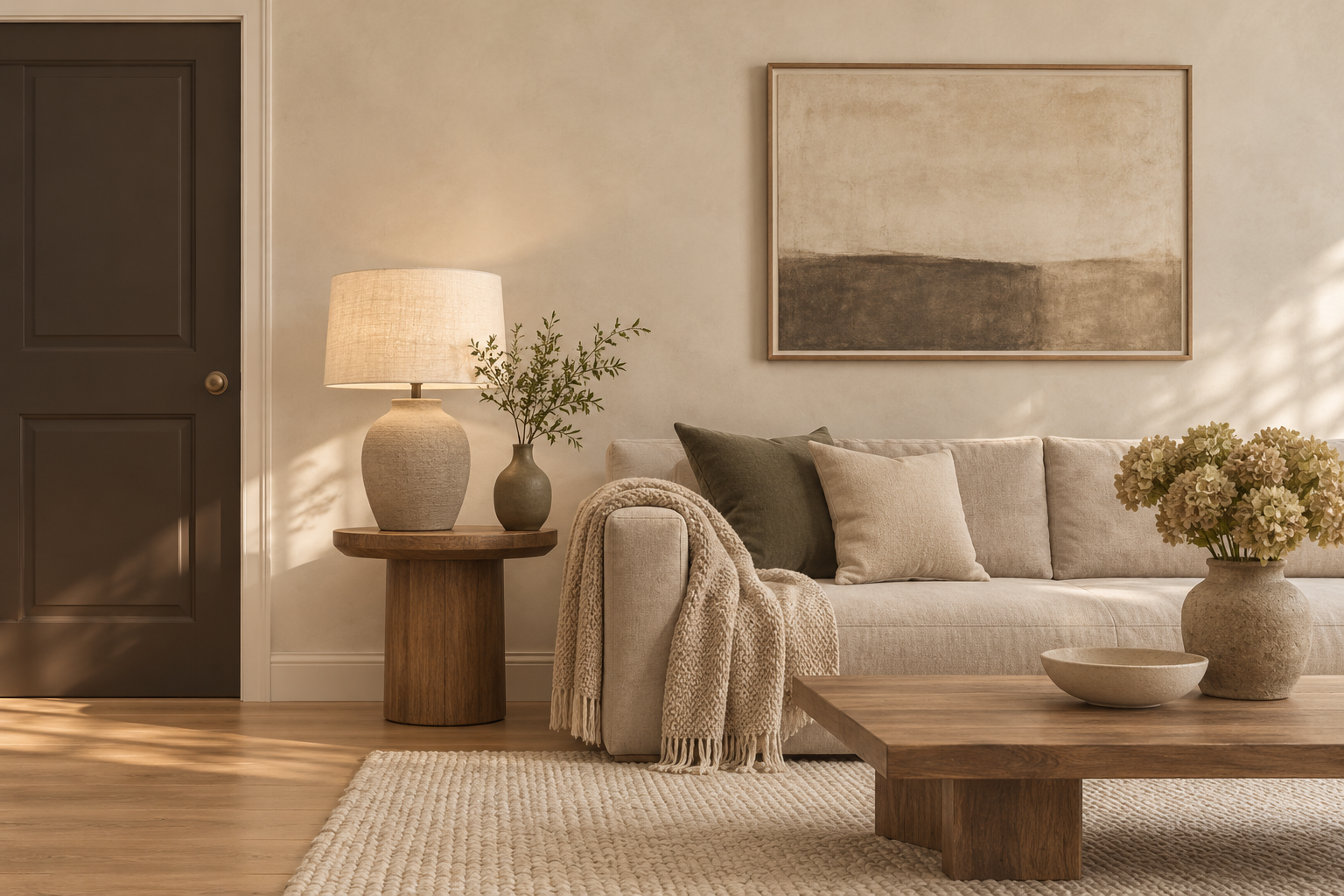
A pale palette needs something deep to be pale against. As a rough rule of thumb, aim for around 5 percent of what the eye sees: an interior door, a window frame, one run of cabinets, a lamp base. Leave it out and the room tends to look washed out.
Formula: one dark tone, in one or two places, kept small.
Two codes suit the role. Black Tar 2126-10 from Benjamin Moore, which the brand pairs with Cloud Cover OC-25 in its minimalist kitchen example, and Pelt No. 254 from Farrow & Ball, which the maker suggests for darker schemes alongside Skimming Stone.
If painting a door dark feels like too much, organic textures can carry that weight where paint cannot: a chunky wool rug, a dark linen curtain or a jute basket by the door.
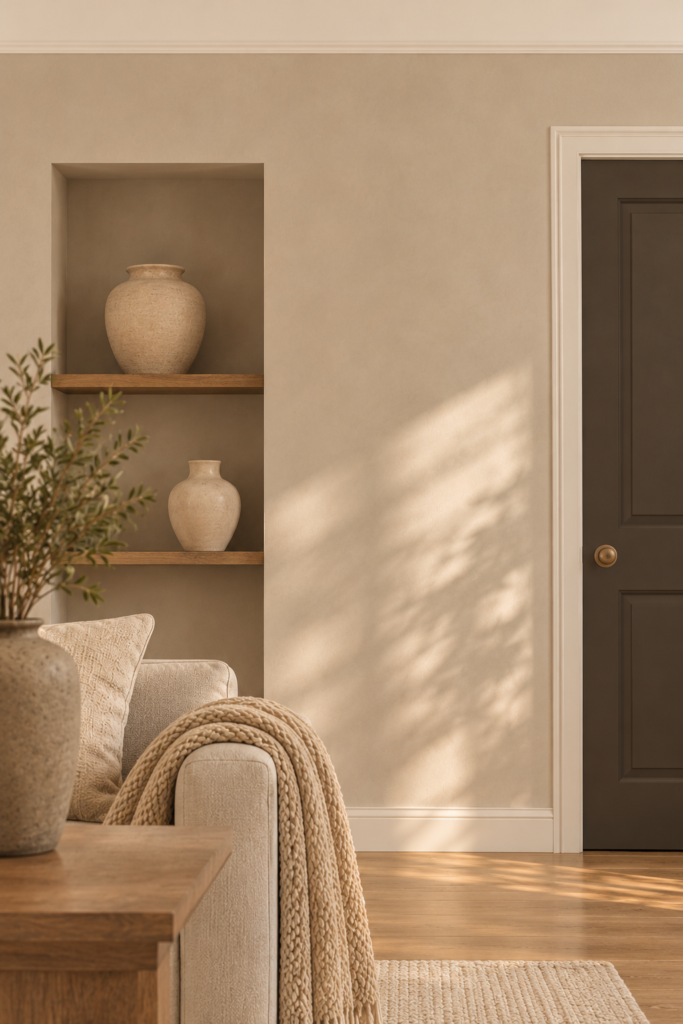
Three minimalist neutral colour palette formulas with exact paint codes
These three neutral colour combinations all follow the five rules. Codes belong to each brand, so check the number on the brand’s own colour page before you order, since ranges are renamed or discontinued from time to time. Many paint shops can match a chip from another brand, but a match is usually close rather than identical, so ask for a sample first.
Palette A: Warm plaster (Farrow & Ball)
Walls: Skimming Stone No. 241
Ceiling and trim: Wimborne White No. 239
Deeper tone: Elephant’s Breath No. 229
Dark note: Pelt No. 254
Best for: rooms with yellow toned oak, linen and soft daylight.
Watch out for: in a very dim room it can look flat, so sample it first.
Palette B: Soft greige (Benjamin Moore)
Walls: Balboa Mist OC-27
Ceiling and trim: Simply White OC-117
Deeper tone: Edgecomb Gray HC-173
Dark note: Black Tar 2126-10
Best for: rooms with mixed wood finishes, where a greige sits between warm and cool furniture.
Watch out for: greiges shift with the light, so check the sample in the morning and at night.
Palette C: Soft white base (Benjamin Moore)
Walls and ceiling: White Dove OC-17 (one white throughout, so the depth comes from the joinery)
Deeper tone: Pashmina AF-100
Dark note: Black Tar 2126-10
Best for: small or dim rooms where you want pale walls that almost disappear.
Watch out for: off whites can read creamier under warm bulbs, so test them under the bulbs you will really use.
Choose A if your wood is yellow toned and you want a plaster look. Choose B if your wood finishes differ. Choose C if the room is small and you want the walls to recede.
Common mistakes, and when these rules do not apply
Five mistakes and their fixes
Mistake: choosing from a small chip.
Consequence: a chip looks lighter and cleaner than the same colour across a whole wall, so the finished wall reads deeper than expected.
Fix: sample large, as in the test below.
Mistake: mixing undertones across large surfaces.
Consequence: one neutral turns pink or green beside another.
Fix: apply Rule 1 and change the cheapest large item, often a rug or cushion cover, before repainting.
Mistake: judging colour under shop lighting.
Consequence: the colour at home can look different, often duller or cooler.
Fix: sample at home, under your own bulbs.
Mistake: bright white trim against warm walls.
Consequence: the trim can look harsh, and edges jump out instead of fading.
Fix: use a trim white from the same family as the walls, one step lighter.
Mistake: no dark note.
Consequence: the room tends to look washed out, and the textures have nothing to push against.
Fix: add one small dark tone, as in Rule 5.
When these rules do not apply
In a rented room you cannot repaint, the same logic works with textiles: keep curtains, bedding and rugs in one undertone and let the wall be what it is. If a room has a fixed coloured feature, such as green tiles, a red brick fireplace or a tinted floor, start Rule 1 from that feature instead of from paint. And if you want a deliberately stark look, all white or near black, the stepping in Rule 2 loosens, though the single undertone still holds.
A six step sample test before you buy paint
A sample test takes two or three days and costs far less than repainting a room. This is the order that works.
1. Put your usual evening bulbs in first, so the test sees the light the room will really have.
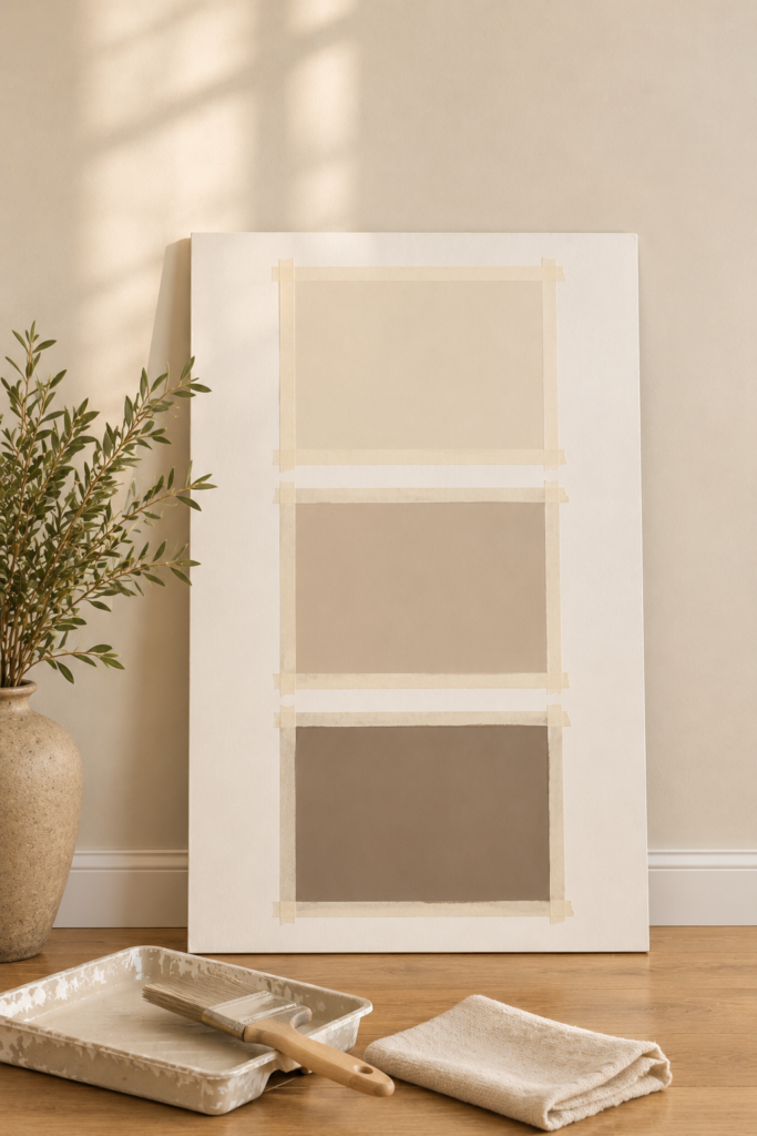
2. Paint two sample boards, each at least 50 cm square, instead of painting the old wall, because the old colour changes how the new one reads. Mask the edges with painter’s tape and leave a white border so the colour is judged on its own.
3. Stand one board on the window wall and one on the opposite wall, then move them next to your floor and your largest fabric.
4. Look at them three times: morning, mid afternoon and evening under lamps.
5. Hold a sheet of white paper beside each one to see the undertone, as in Rule 1.
6. Leave them up for two or three days, then pick the colour that still looks calm at the worst time of day.
Before you test paint, check your bulbs
Paint samples only tell the truth under the light your room will really have. If your lamps still use cool white bulbs, swap them for a warm white bulb first, then run the test.
Warm white LED bulb, 2700K
Neutral paint colours and paint codes: your questions answered
How many neutral colours does a minimalist room need?
Three or four main ones: the wall, a white for ceiling and trim, one deeper tone and one dark note. Textiles should repeat those tones rather than add new ones. More colours are possible, but each one dilutes the calm, so add them slowly.
What is the best neutral paint colour for a north facing room?
There is no single answer, but a warm leaning neutral usually copes better than a cool grey because northern light is cooler. Skimming Stone No. 241 and Balboa Mist OC-27 are two examples from this article. Sample either one on two walls before you commit.
Why do my neutral walls look pink or green?
Usually it is undertone, shown up by a neighbouring colour or by the bulb. Check the colour against white paper, then look at it at night under 2700K lighting. If it still reads pink, a neutral from a greyer or greener family will cancel it.
Can I use these paint codes with a different brand?
Codes belong to the brand that made them. A shop can often match a chip with a colour scanner, but the match is usually close rather than exact, and the paint base differs between brands. Buy a sample pot of the matched colour and test it before ordering a full tin.
Is white a good neutral for a minimalist room?
Yes, if it belongs to the same undertone family as everything else. A very bright white beside warm wood can look stark, while a soft white such as White Dove OC-17 sits more gently. Pick one white and use it consistently.
What to do this weekend
Decide the undertone first, then set three steps of depth, check your windows and wood, and add one small dark note. Pick one of the three palettes above, buy sample pots of its three main colours and run the six step test over a weekend. If the room still feels empty once the colour is right, the fix is usually layers rather than more paint, and our guide to warm minimalist interior design covers them.
Author and editorial note: This article is written to help readers choose neutral paint colours. Paint names, codes and ranges change, so check each brand’s colour page and test a sample in your own room before buying.